In terms of usability, design can decide success or failure.
For instance, when designing software user interfaces, poor design can not just define whether a product works or not, if done badly can lead to health problems; unclear text causing headaches, too many mouse movements and clicks leading to RSI. This is called Human Computer Interaction, or HCI for short. When software testers talk about software being 'intuitive', 'organic' or 'natural' in operation, this often reflects the amount of work that the developer has done to ensure the most comfortable user experience.

But when it comes to South Tyneside Council, design seems to have become a function of expediency. The awful fake chimneys on the former Nook public house won a design award for 'innovation'. They were introduced to allow a mobile phone company to hide their telecommunications equipment. Three years later and the appearance of these 'innovations' just gets worse.
The cubist monstrosity of the Quadrus Centre is another example of design which seems to be ugly form more than pretty function. However, South Tyneside Council seems desperate for a signature icon to represent it's aspirations for a thrusting entrepreneurial culture, so if the council feels a couple of oddly placed boxes do the job, then who am I to argue?
'Streetscape' design though, is less esoteric than the concepts behind Jenga wannabe Quadrus.
Street planning, if done badly, can mean the difference between life and death. Streetscape isn't just about green verges and pretty flower planters, it serves a 'mission critical' function.

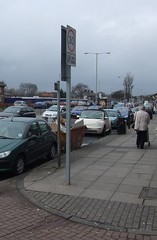
Walking along the Nook shopping centre I came across what has got to be a beacon of council design incompetence. The road sign to the left has been positioned in such a way that 4 feet of pedestrian space has been effectively removed, also creating a pinch right next to a road crossing point. In this one simple instance, pedestrians have been failed by the road planners.
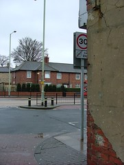
However, looking at the sign from another angle (image below), from a driver's perspective, and the realisation of impractical planning practice is complete. The sign's position means that it isn't visible to drivers coming out of the lane until they are 7 feet away from the end of the lane, a busy pedestrian crossing point.
I'm sure that the planners have followed all the neccessary rules and regulations and that the sign's position is perfectly legal. However, the sign's position is not sensible, not for pedestrians or drivers.
There are practical alternatives. One could be to extend the 20mph zone to the perimeter of the parking area adjacent to Prince Edward Road, and place the sign at the exit from the parking area onto Prince Edward Road. However, this would likely require changes to road orders and byelaws. A simpler alternative would be to move the signpost closer to the road, a matter of two feet, remove the existing signpost which holds a parking restriction sign, adding the parking restriction sign to the speed signpost.
It seems like a big deal all because of a simple street sign. But if the Council can't get the little things right, then what hope have we for the big projects?


